
A Collaborative Team Preserves a Singular Legacy
The Alfred Stieglitz Collection of Photographs
In 2016, the Art Institute of Chicago launched a comprehensive online resource dedicated to photographs from the Alfred Stieglitz Collection, a core of the museum’s photography holdings. The second of three such endeavors funded by a grant from the National Endowment for the Humanities, the site was the result of an intensive collaboration among a wide variety of museum professionals. The 244 photographs from the noted photographer, gallerist, and editor's collection were gifted to the museum in 1949 by Stieglitz’s widow, Georgia O’Keeffe, and include key works from across Stieglitz’s career as well as photographs by pictorialist associates, nineteenth-century photographers he admired, and young, modern photographers he supported.
The site’s mandate is to offer new scholarly research in an easily accessible format, and altogether it contains more than 900 images, including new object photography, contextual images, and photomicrographs. Among its features are an essay about the collection’s history; glossary entries on twenty-one artists, three galleries, two journals, twelve photographic processes, nine photographic series, and seven art historical themes; a gallery of downloadable images of each work, including recto, verso, mounts, photomicrographs, and other technical images; a downloadable PDF with detailed object information such as inscriptions and technical summaries; additional object analysis on 44 works using a wide range of scientific analytic tools; and links to original sources such as selected exhibition catalogues, related photographs, correspondence, and published reproductions of the artwork.
The project’s team members come from across the museum and include curators, conservators, conservation scientists, and the digital experience team. Nearly a year after the online resource launched, the team came together again to reflect on collaboration, compromise, and what they learned. Elizabeth Siegel, Curator of Photography at the Art Institute of Chicago, and Ariel Pate, Assistant Curator of Photography at the Milwaukee Art Museum (and project manager of the site while a curatorial assistant at the Art Institute), facilitated a discussion within the team.
A key goal of the site is to demonstrate an understanding of Stieglitz and his circle outside of the traditional monographic narrative of art history, but also at the center of a network or set of networks. We wanted to show the interconnectedness of the figures, movements, institutions, and objects we were examining. How did you get those ideas across? What design or content decisions helped cement those connections?
Elizabeth Siegel: This was of paramount importance from an art historical perspective: how can we show the site’s visitors that the personalities, movements, galleries, and journals for disseminating images and ideas were central to understanding the photographs themselves? We tried to promote a fluid back-and-forth between these entities by including multiple and repeated links among the textual information. For example, looking at a work by James Craig Annan might lead you to the definition of photogravure, which might prompt a look at Camera Work, which could connect you to the goals of the Photo-Secession, which might lead you back to Stieglitz, and so on in a continuous (and, we hoped, mildly addicting) loop.
Tina Shah, Senior Front End Developer, Digital Experience department, Art Institute of Chicago: The design and functionality of the website was important in illustrating the vast network of artists, processes, and spaces. Our team looked at the breadth of content and began to examine ways we could harmoniously organize the information while still keeping with the style of the artists and times. We also implemented a WordPress theme that allowed for content to be searched via filters and tags such as “processes” and “Pictorialism.” The result was an effective, image-focused resource guided by intuitive navigation and a simple structure for links to related materials.
Kaslyne O’Connor, Andrew W. Mellon Paper Conservation Fellow, Museo de Arte de Ponce in Puerto Rico (formerly Samuel H. Kress Fellow at the Art Institute): In the materials research, we aimed to allow comparison on how different artists employed the same processes (for example, platinum prints were used by Stieglitz and Frank Eugene to different effect) as well as how individual artists explored a variety of techniques to interpret the same negative (Eugene made both photogravure and platinum prints of the same image). We focused on 44 artworks that were chosen because they were “representative” of the diverse materials and important artists in the collection. From more simple salted paper prints to complex gum-bichromate works, the photographs represent a historical timeline of photography and of the artists that created them. Elemental and organic analysis gave us clues on the making of these prints, allowing us to compare individual practices within this group. It helped us understand or confirmed that certain artists were extremely experimental while others followed traditional methods.
Ariel Pate: Because we knew Alfred Stieglitz would inevitably be at the center of the project, one early decision was about the way the glossary entries would be written: since artists like Paul Strand and Edward Steichen had careers that spanned far further than their relationship with Stieglitz, we decided that the entries should, as a basic principle, take their subjects’ relation to Stieglitz as a starting point. So even though the site isn’t all Stieglitz, all the time, it reflects the reach of his influence on all these varied movements and groups of artists.
We had hoped that people would not only make broad connections, but would be encouraged to examine individual objects more deeply. How did you foster deep looking and further study of photographic objects?
O’Connor: Part of my task was to gather a lot of technical information on each print in the collection, including, but not limited to, dimensions, color, thickness, and the presence of inscriptions and original mounts. We used various analytical instruments to confirm the presence of platinum and other organic compounds as well as to confirm the medium, and looked at the works under ultra-violet radiation to see if there were adhesives or coatings on the prints. To present all this really detailed and relatively specialized information, we created standardized “Object Research” PDFs that can be downloaded from each artwork’s page. The PDFs also include a technical summary of the analysis, which gives context to the data and explains why certain unexpected elements or compounds could be present in a print. Our data can easily be compared with information on works in other collections. For example after discovering the element chromium in unusual mount papers by F. Holland Day, we were able to compare our results with collection information from the Library of Congress to determine if the mounts were original to the work.
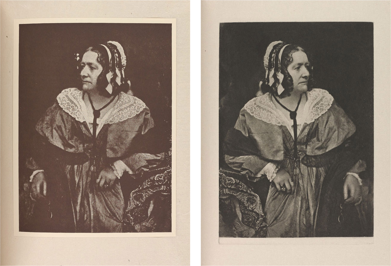
Sylvie Pénichon, Senior Conservator of Photographs at the Art Institute of Chicago: Interesting features of objects were documented visually. For example, in David Octavius Hill and Robert Adamson’s Dr. Chalmers (1843/46), the distortion produced by the tension exercised by the carbon print on the back of its mount was photographed in raking light to make it prominently visible and give a sense of three-dimensionality to the viewer. In another case, examination under UV radiation showed that Frank Eugene’s La Cigale (1898) was originally mounted near the top of its paper mount. An historical installation view confirms this placement, and we are able to show all of these images on the site. Many of the detail views and microphotographs are further explained in narrative technical summaries within the PDFs.
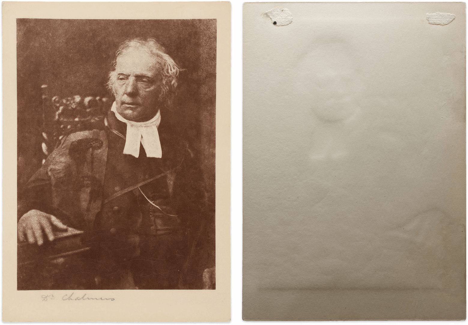
David Octavius Hill and Robert Adamson, Dr. Chalmers, Recto and verso, 1843/46, printed 1890/1900
Carbon print, 15.8 x 11.5 cm (image), 18.6 x 13.2 cm (paper)
Art Institute of Chicago, Alfred Stieglitz Collection, 1949.680
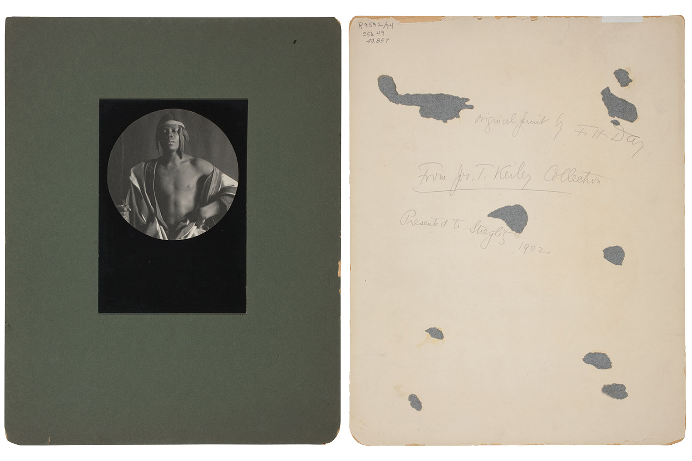
Pate: I felt it was really important to show as much visual information about the photographs as possible—to allow the site viewer to feel that they had really “seen” the print in its entirety. This comes into play when one considers the mounts that Pictorialist photographers preferred: there are often layers upon layers of paper mounts, stacked to create a frame for the image itself that separates it from the wall it’s displayed on. Some of the photographs within this collection by F. Holland Day and Edward Steichen reflect this presentation style, and it’s something that’s often missing when one sees images of their work online, or even when it’s framed in the museum. Yet this elaborate mounting style was really important to how they presented their photographs. So part of the imaging process for the site included views of just the photographic image, but also the entire recto with the original mount, when present. Many of the prints also have inscriptions on the back, dedications to Stieglitz, framing notes, and so on. These notes add something to one’s understanding of the life of each print, so it was important to include images of them. Even, in some cases, using infrared-spectrum photography to make otherwise invisible graphite inscriptions visible, such as in the case of the verso of Steichen’s Rodin—Le Penseur.
![Recto, with original mount; F. Holland Day (American, 1864–1933); An Ethiopian Chief, 1897, printed c. 1902 [?]; platinum print; 21 x 18.6 cm (image/paper); 21.8 x 19.5 cm (primary support); 22 x 19.7 cm (secondary support); 22.8 x 20.7 cm (tertiary support); 45.7 x 35.5 cm (quaternary support), Art Institute of Chicago, Alfred Stieglitz Collection, 1949.858](https://journal.voca.network/wp-content/uploads/2017/10/EthiopianChief_recto_with_mount_shadow.png)
F. Holland Day, An Ethiopian Chief, Recto, with original mount 1897, printed c. 1902 [?]
Platinum print, 21 x 18.6 cm (image/paper), 21.8 x 19.5 cm (primary support), 22 x 19.7 cm (secondary support), 22.8 x 20.7 cm (tertiary support), 45.7 x 35.5 cm (quaternary support)
Art Institute of Chicago, Alfred Stieglitz Collection, 1949.858
Kelly McHugh, Production Coordinator, Digital Experience department, Art Institute of Chicago: The many images, PDFs, and key sources that we wanted to include on the pages for each of the artworks presented a design challenge for us—what is the hierarchy of information and how do we make it all noticeable and accessible? We brought in an image slideshow feature, in which the images related to an artwork scroll by automatically, allowing the users to see everything, starting with the main image, and including details or reflective UV imaging, mounts, and installation shots. Basic object information and the curatorial write-up appears immediately below the images, with object-specific research and links to primary sources to the left. Visually, we used the color orange to signify links, and the maroon bars to separate different types of information.
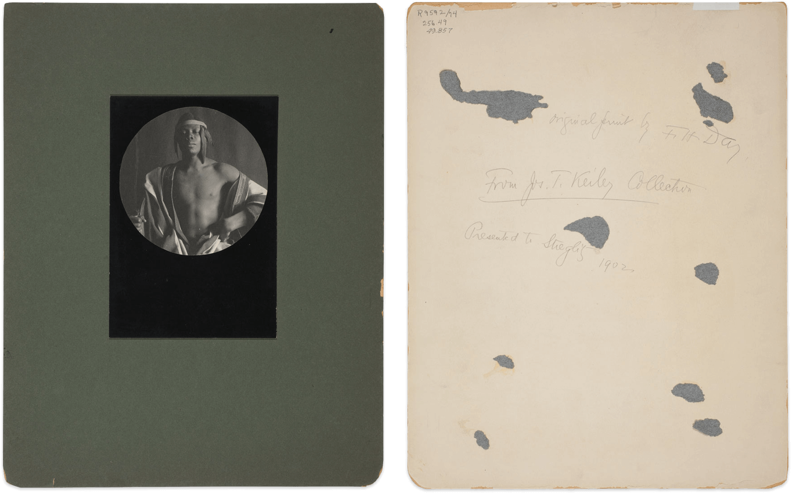
F. Holland Day, Ethiopian Monarch, Recto and verso with original mount, 1897, printed c. 1902
Platinum print, 10.9 cm (image/paper diameter), 17.8 x 12.3 cm (first mount), 35.6 x 27.9 cm (second mount)
Art Institute of Chicago, Alfred Stieglitz Collection, 1949.857
Siegel: I really appreciated how our digital team kept the objects—rather than flashy technology or distracting design that calls attention to itself—at the forefront of the viewing experience through the lightbox on the artwork pages and the auto-sorted thumbnails on the main landing page. Including photomicrographs instead of a “zoom” feature, for example, was a great balance between what the curatorial department requested and what the design and digital team proposed, and I think the solution we landed on helps visualize and describe the works.
We were challenged to present clearly and cleanly many different kinds and levels of content. These ranged from newly produced art historical texts and detailed technical photographs of the objects to various digitized primary source documents from the Art Institute and other institutions. What strategies did you use to present the various types of information?
Siegel: I love primary sources for the direct information they offer on a work or an artist, but also for all the indirect knowledge that provides a sense of the period: for example, what typefaces were deemed appropriate alongside photographs? What kinds of frames did they use? Who advertised in Camera Work? It was really important to me that we give users as much of that original context as possible so that they could understand Stieglitz’s radical proposition that photography was an expressive art form. Offering this context in an online resource allows what a book or exhibition cannot: links to numerous original journals, exposition catalogues and checklists, installation shots. But then you have to tell a story, weave a narrative, to connect all of this disparate material. That’s where the glossary entries come in, to give context to the original documents so that the viewer can understand, say, how fascinating it was that Stieglitz gave so much wall space in his 1910 Albright Gallery exhibition to nineteenth-century photographer David Octavius Hill, whose work had been made nearly 70 years prior but whom Stieglitz held up as an artistic ancestor.
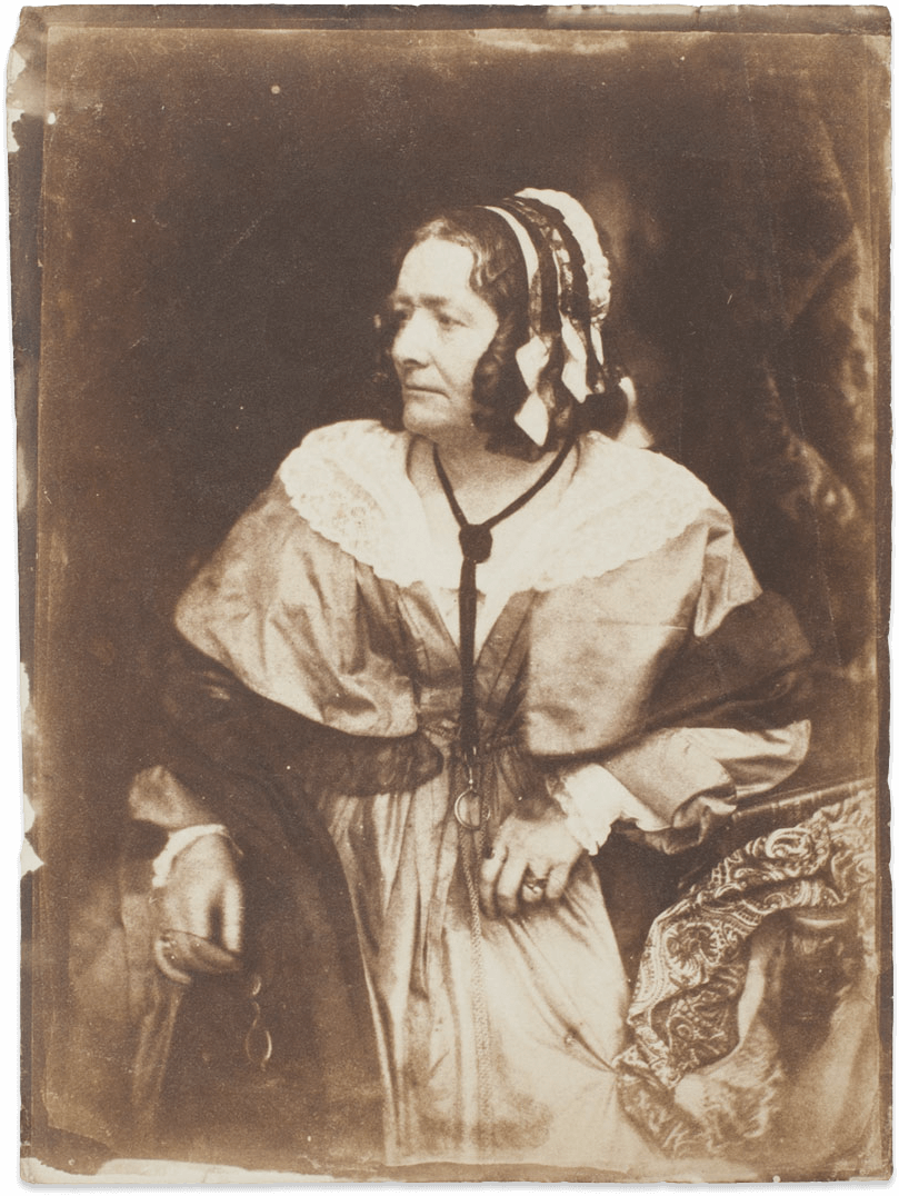
David Octavius Hill and Robert Adamson, Mrs. Anna Brownell Jameson, 1844
Salted paper print, 21 x 15.5 cm (image), 21.8 x 16.2 cm (paper), 35 x 28 cm (mount)
Art Institute of Chicago, Alfred Stieglitz Collection, 1949.687
O’Connor: Much of our analysis was conducted in connection with research on primary sources to confirm some of the information we uncovered. For instance, XRF analysis of Mrs. Anna Brownell Jameson, a salted paper print by David Octavius Hill and Robert Adamson, showed unusual signals for cobalt and lead. When we looked under the microscope, we saw small blue particles in the paper fibers, photographs of which we were able to include on the site. Further research led us to discover that ground blue cobalt glass was sometimes included in 19th-century writing paper to increase the appearance of whiteness and help prevent yellowing over time. It’s a reminder that Hill and Adamson were working at a time before photographic supplies were formalized. Results of X-ray fluorescence spectroscopy were presented in the “Object Research” PDFs as a standardized graph table, with an image map of each work to illustrate exactly where each reading was taken. This ensures future analysis can be compared and analyzed more easily.
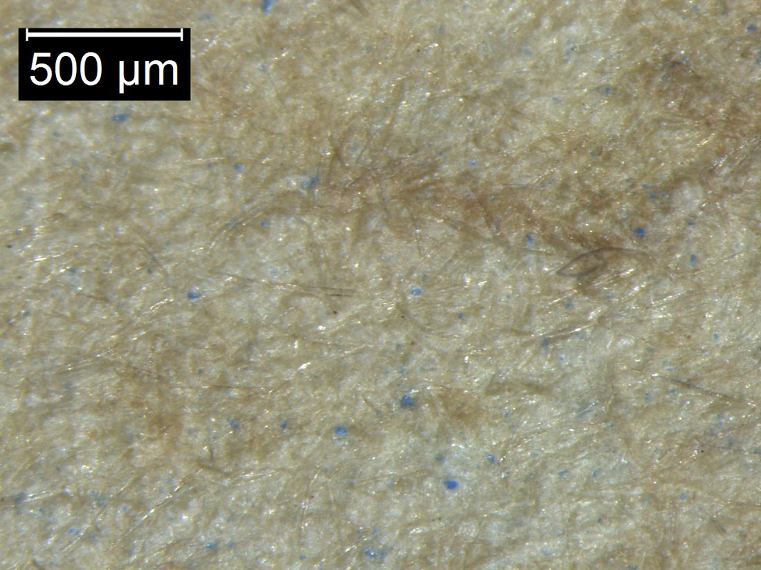
David Octavius Hill and Robert Adamson (Scottish, 1802–1870 and 1821–1848), Mrs. Anna Brownell Jameson, Photomicrograph showing cobalt glass particles, 1844
Salted paper print, 21 x 15.5 cm (image), 21.8 x 16.2 cm (paper), 35 x 28 cm (mount)
Art Institute of Chicago, Alfred Stieglitz Collection, 1949.687
left: David Octavius Hill and Robert Adamson, Mrs. Anna Brownell Jameson, 1844
Reproduced in Camera Work, no. 11 (July 1905)
right: David Octavius Hill and Robert Adamson, Mrs. Anna Brownell Jameson, 1844
Reproduced in Camera Work, no. 37 (January 1912)
McHugh: The design for the site was all about merging the historical context of the works with a modern and clear display. During the initial design phase, we pulled inspiration from images in the collection, fonts that were used in different journals from the time, and even a podcast about Alfred Stieglitz. The layout of the site is simple and clean, which leverages the colors and fonts inspired by the period. Meanwhile, all the glossary texts on themes, series, processes, journals, and artists are presented in the same format as a way to understand the objects and their broader context in photography.
Pénichon: I think this is true of the technical data as well; even though the site is loaded with information, the consistent organization of data helps alleviate the sense of it as a “heavy content website.” The technical summaries connect all those dots together, improving further the fluidity of site.
Shah: Whether you click on an artist, process, or another subject, no matter what page you land on, you are presented with an organized list of related resources to further enable your research if you so choose! However there is plenty of information available at first click which satisfies the experience for the casual reader as well as the scholar.
Pate: Once I started to dig into the art historical research, and Kaslyne started into her more in-depth material analysis, it became clear that we were going to have many different resources that connected to the same artwork, and that many of the works connected to the same resources. For instance, numbers written on the back of some of the prints by Heinrich Kuehn ended up corresponding to catalogue numbers from the 1910 exhibition of Pictorial photography organized by Stieglitz in Buffalo, New York. To be able to link directly to a PDF of that catalog that’s been digitized by another institution, and to know that these prints in particular were the ones shown, gives their histories a dimensionality that might not otherwise be possible. I really appreciated how the digital experience portion of our team was able to help us untangle the abundance of resources, both internal and external, primary and secondary, that we wanted to connect the artworks to.
In addition to presenting many different kinds of information, the site also seeks to reach several different audiences, including the general public, art historians, conservators, and so on. What impact did knowing this have on the content you created for the site? On a related note, the project team itself came from a variety of departments—how do you think working in an interdisciplinary group affected the outcome of the site?
Pate: For our audiences, I think we really tried to make the landing page welcoming and accessible to the everyday user, while also layering more specialized information deeper within the site (but still easy to navigate to, and clearly marked). It was a challenge not unlike curating an exhibit: how do you speak to multiple audiences within the same space, and offer each audience something that they will find interesting? An interdisciplinary spirit ran throughout this project and site. For me, having a strong conservation component made a huge impact: Understanding the beginnings of photography-as-art in America is one thing, but I found it really deepened my understanding of the photographs to have a conservator’s view into how the artists made the photographs, and what that means for how they look. Understanding the tools and processes the photographers had at their disposal, and being able to confirm their use through the materials analysis Kaslyne and Sylvie conducted, revealed the experimentation many of these artists (not just Stieglitz) were undertaking within the photographic medium to achieve “Pictorial” effects.
McHugh: Working with a small team with very different backgrounds meant that we all had to think creatively and at times compromise. For example, a priority for curatorial was to make sure that visitors to the site know how much content it contains, while design wanted to keep this simple and clean. Originally the header on the homepage had just one paragraph with images; we changed this to a slideshow of three paragraphs, and we condensed the size so that when landing on the page, visitors can see that there is more to explore further down on the site. While curatorial and conservation were busy creating all this wonderful content, digital and design were working on the best way to make it digestible. We wanted to make sure that anyone visiting the site would enjoy it, whether they were there for research or to look at the photographs in the Alfred Stieglitz Collection.
Pénichon: It is easy to underestimate how specialized our fields are and to assume that our colleagues share a general understanding of what each of us do. The interdisciplinary nature of this project tested these assumptions and helped us create a resource that is accessible yet sophisticated. Understanding the limitations of technology, the background implications of certain features of the site, or the different layers of information gathered helped team members reassess priorities and/or expectations and deliver a well-balanced end product.
Shah: I loved working in an interdisciplinary group as opposed to silos. I found it important for all members of the team to learn about the mission of the website from the start as well as changing goals and challenges that were experienced as the project evolved. For example, understanding the curator’s vision for the project helped us make decisions on the design, and clarifying the target audience and the intentions for the content helped our team figure out how to provide the most optimal user experience. This could range from how much information to provide when a user rolls over an image to what sort of visuals would grab the user’s attention when the site first loads. Interdisciplinary collaboration better informs the work that I do as a developer and fellow collaborator.
O’Connor: Having the digital team weigh in on how the general public would digest information was very helpful. For example, our conservation research compiled a variety of highly specific and technical information, and the consensus was to make it available as a separate PDF. For academics, historians, researchers, institutions, or anyone interested in a scientific examination of photographs, these can be viewed or downloaded directly from the site.
Siegel: You create something and put it out into the world, but never really know how it will be used or what it might inspire. We hoped that a casual viewer could find information quickly while a curious scholar might end up deep in the rabbit hole. That put a lot of pressure not only on the wide range of information we presented (photographs, technical reports, primary sources, and art historical texts) but especially on the design and the hierarchies of that information. A careful viewer will be rewarded with more! And working with an interdisciplinary group was fantastic; this was a team of problem-solvers. Stieglitz himself was a bit of a one-man band—artist, writer, editor, gallerist, collector. We needed a team to showcase his collection.